

Scout Corp was a new project for Sam, she wanted to have a new brand that stood out from the sometimes dull and conservative property management industry.
We advised that Sam go through our Discovery process to help her gain some clarity.
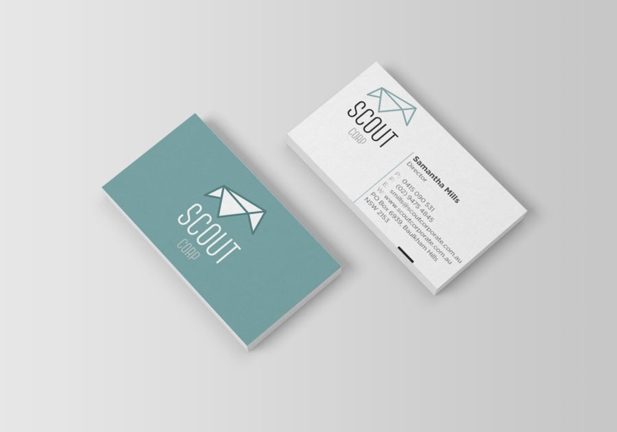
The logo and brand styling we produced was based on an origami house.
We also produced a small animated GIF of the various stages the house goes through when being folded.
We used fresh and light colours to give the business a younger and lighter feel, this allows it to stand out from a dark and heavier competitors
We were very happy with the result and Sam has now moved full time into her business.
Testimonial
I engaged Emma to help me create a new logo for my business. From inception of the idea from the detailed discovery Emma completed, she really understood my business, what I was trying to achieve and the target market I was interested in. My logo is fresh and modern and I absolutely love it! I would highly recommend Emma for her creativity, understanding and unique perspective.
Samantha – Scout Corp